
Motentra brings fleet inspections, vehicle condition and maintenance into a browser-based product. Sean Costner created the brand, interface and software. This is a founder-built product in the Needlerow portfolio.
The design problem
A fleet overview needs to answer a practical question: what needs attention before the next shift? The supporting screens need to preserve enough detail to act on that answer. An inspection flag, a damage record and a maintenance task should remain connected to the right vehicle.
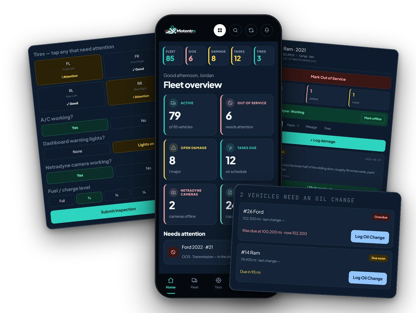
The product also has to work on a phone. A large desktop dashboard cannot simply be squeezed into a narrower screen. The visible interface uses short labels, stacked cards and persistent navigation to keep the most useful information close.
A clear route from overview to action
- Start with status. The fleet overview separates active vehicles, out-of-service vehicles, open damage and tasks. The “Needs attention” area gives urgent items a distinct place.
- Make the inspection specific. The tire checklist identifies front-left, front-right, rear-left and rear-right positions. A flag points to a location instead of leaving the next person to interpret a general note.
- Keep the vehicle as the organizing unit. Damage, maintenance, mileage and tire information sit with the vehicle record. The out-of-service control is visible alongside that context.
- Show what a maintenance status means. The oil-change list pairs due and overdue labels with mileage information. The person reading it can see the underlying number as well as the status.
The visual system
The dark blue interface uses teal for primary actions and a consistent set of cards and navigation controls. Warning colors sit alongside written status labels. Across the example screens, the same type hierarchy distinguishes a vehicle or task from its supporting detail.
Brand identity, interface design and implementation belong to the same product. The useful lesson for other projects is consistency: the visual language should carry from the first introduction to the screen someone uses every day.
What the project includes
- Brand identity and visual direction.
- Interface and user-flow design for fleet overview, inspections, vehicle records and maintenance.
- Responsive browser-based software development.
You can explore the product at motentra.com. This case study documents the design and delivered product; it does not claim measured increases in revenue or productivity.
Apply the same approach to your business
A service page, booking flow or product screen works better when the next action is clear. Needlerow’s web and landing page design covers layouts and build-ready files on Grow from $995/month. Development is quoted separately. Logo and brand work can help the experience feel consistent from the start.
See the Fitopya case study for a different audience and visual direction, or compare design plans.
By Sean Costner, founder and designer at Needlerow Digital. Based in Tyler, Texas; working with businesses across the U.S.